01Art Direction
Concept
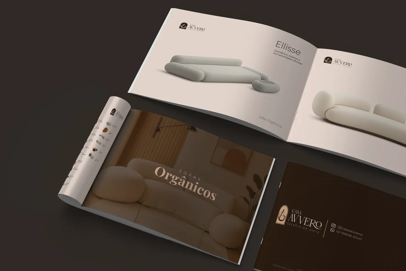
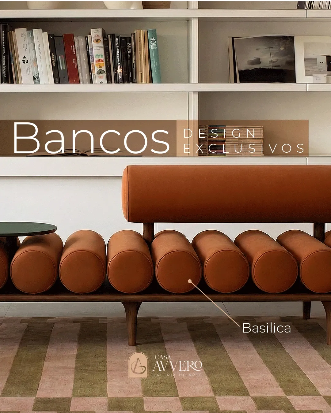
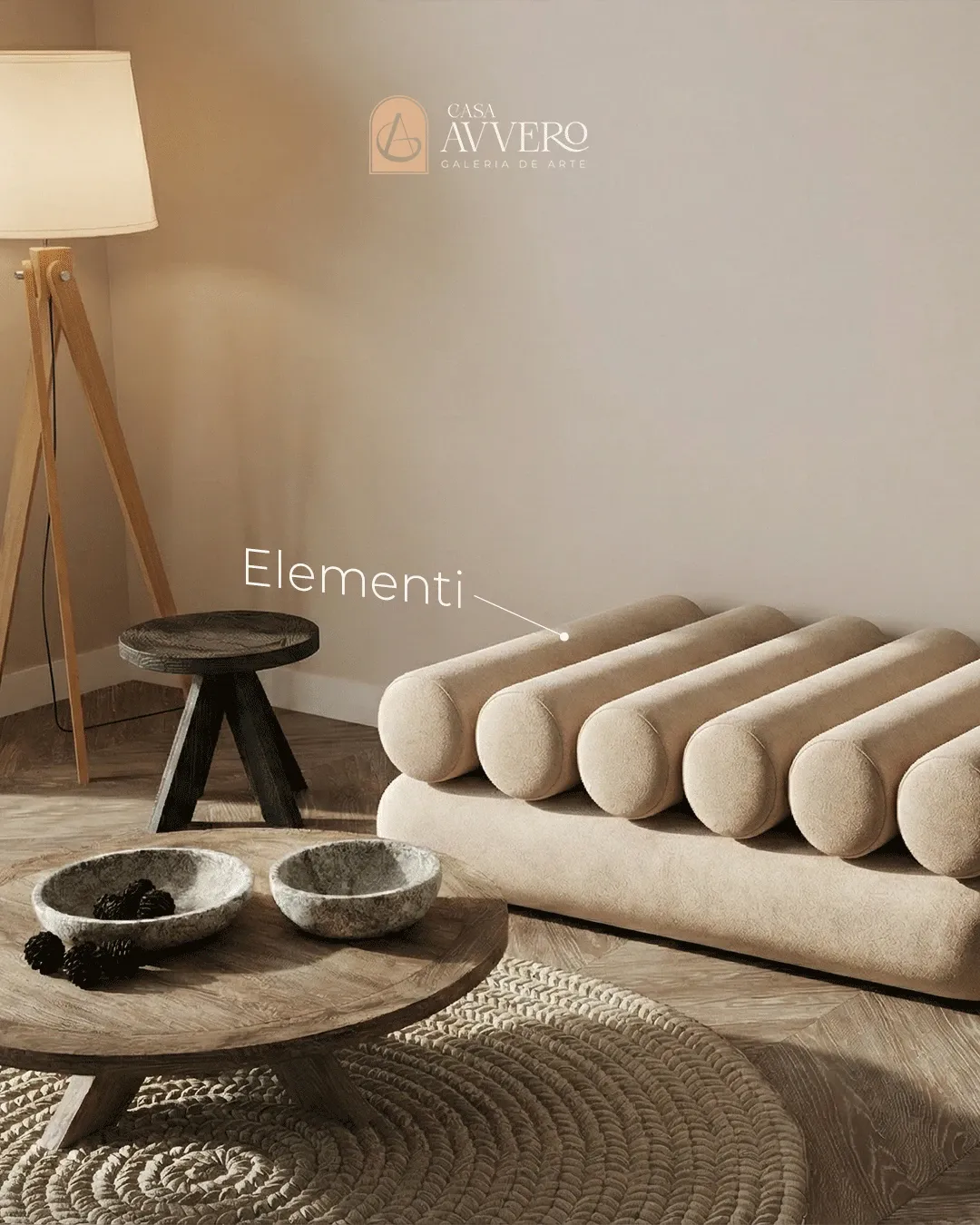
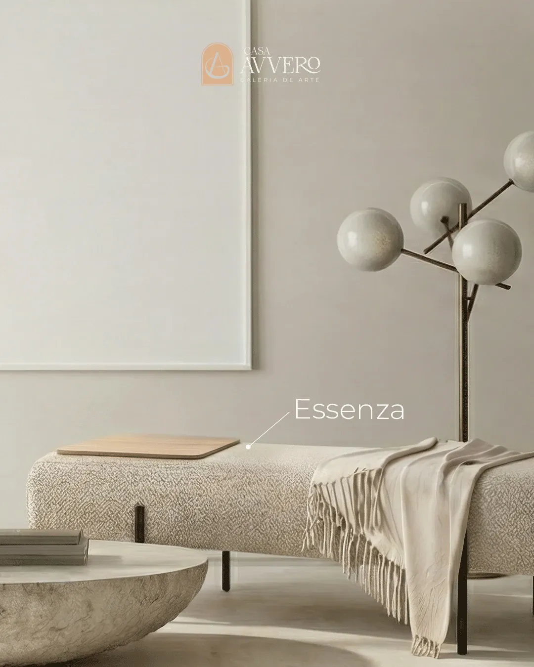
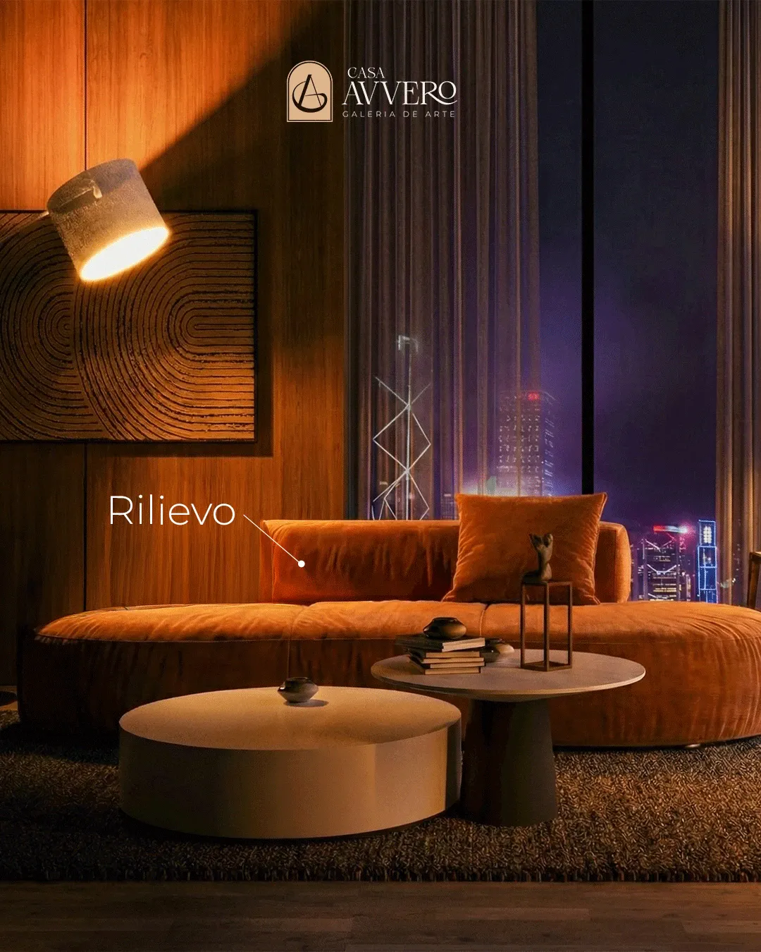
Casa Avvero is not a furniture store; it is an art gallery. Its collection of authorial designs — sofas, armchairs, ottomans, benches and tables — is made to be looked at the way one looks at a sculpture, where comfort and craftsmanship weigh as much as form. The brief, then, asked for the opposite of a product catalog: the piece had to carry the atmosphere of the gallery itself, an exhibition translated onto paper. The decision that guided everything was curation over cataloguing. Each object is framed like a work on a wall, with air and silence around it, so the reader moves through the pages the same way they would move through the gallery floor.
Editorial system
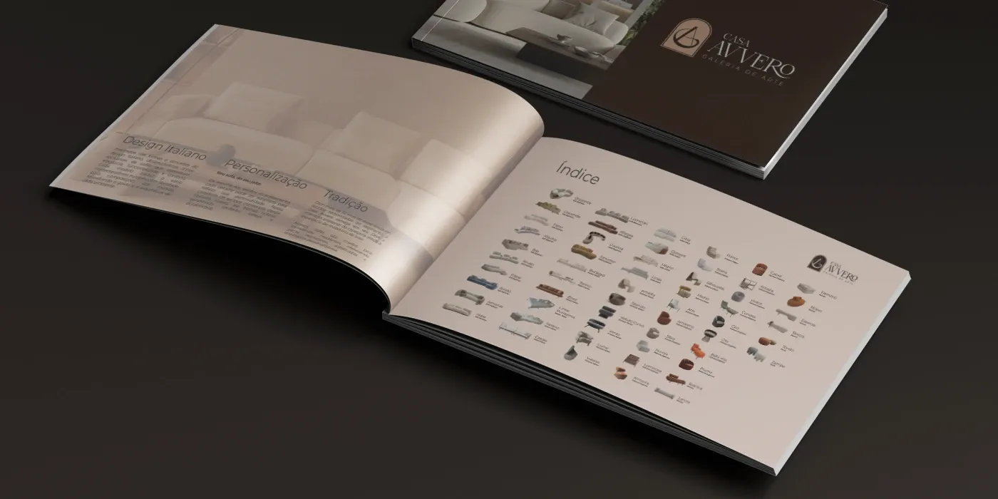
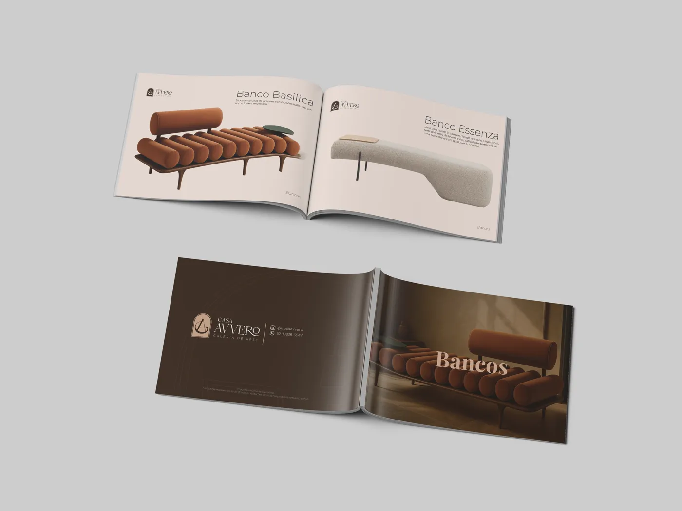
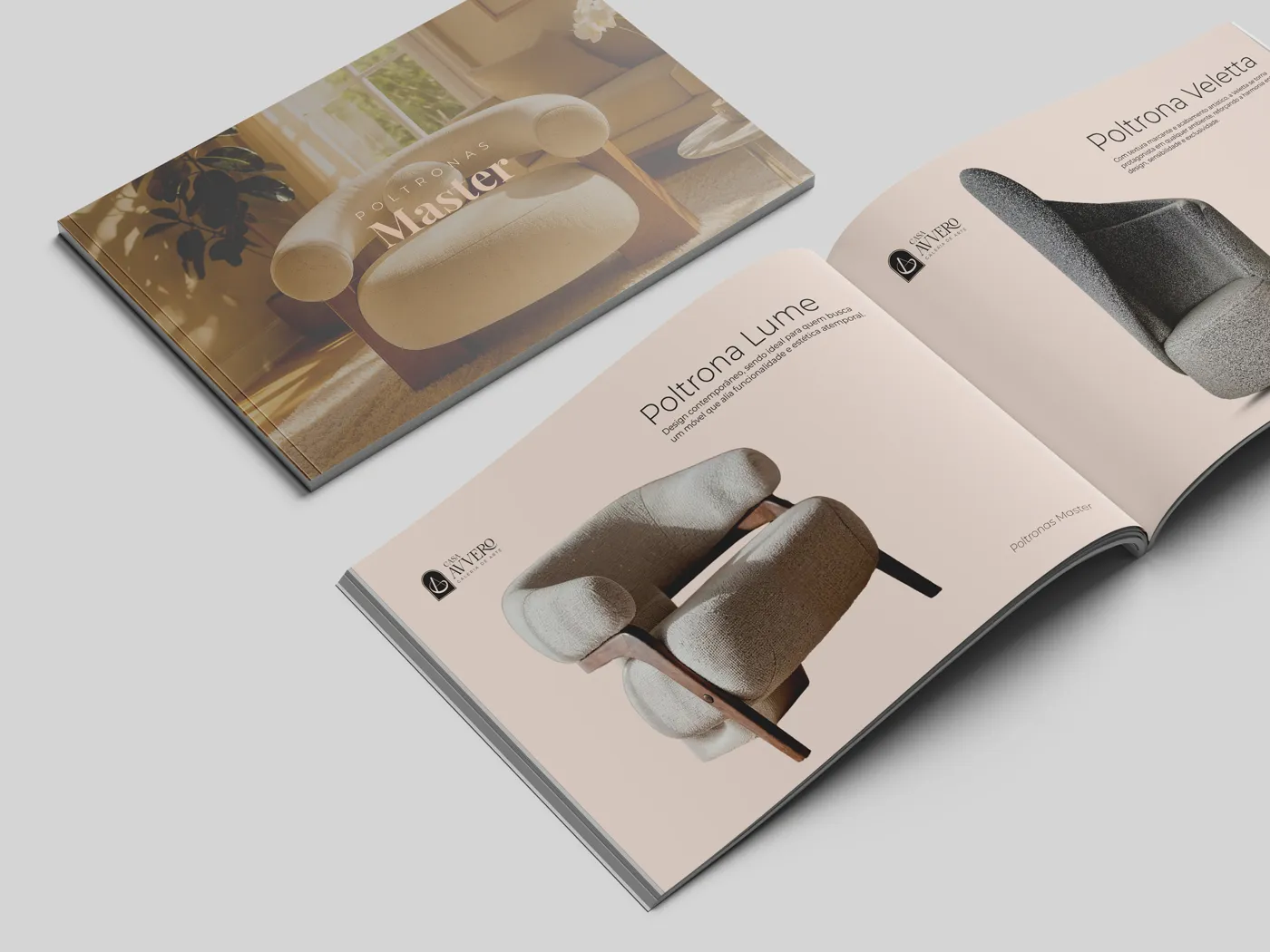
The layout is built on restraint. Wide margins, generous white space and a slow, deliberate rhythm give each piece room to exist, the same way a gallery keeps distance between one work and the next. Typography plays a supporting role: a refined serif for the display moments and titles, a quiet sans for captions, materials and dimensions, never competing with the furniture. Colour is left to the pieces themselves — the grain of the wood, the weave of a fabric, the tone of an upholstery — against a neutral, gallery-white ground that keeps the attention exactly where it belongs.
Application & social
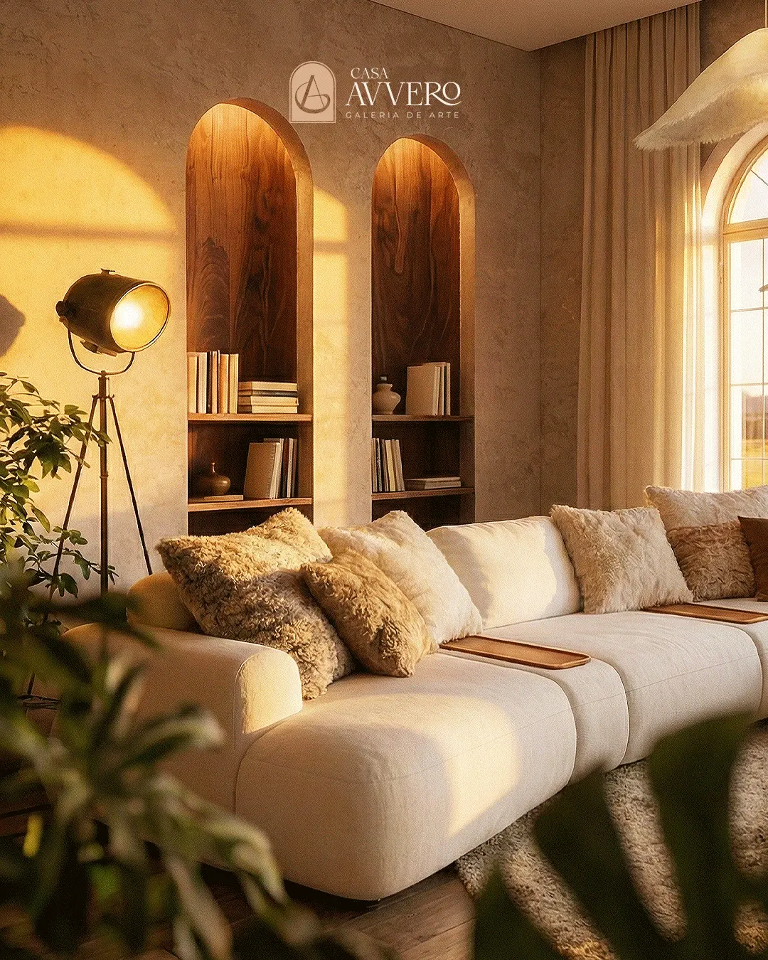
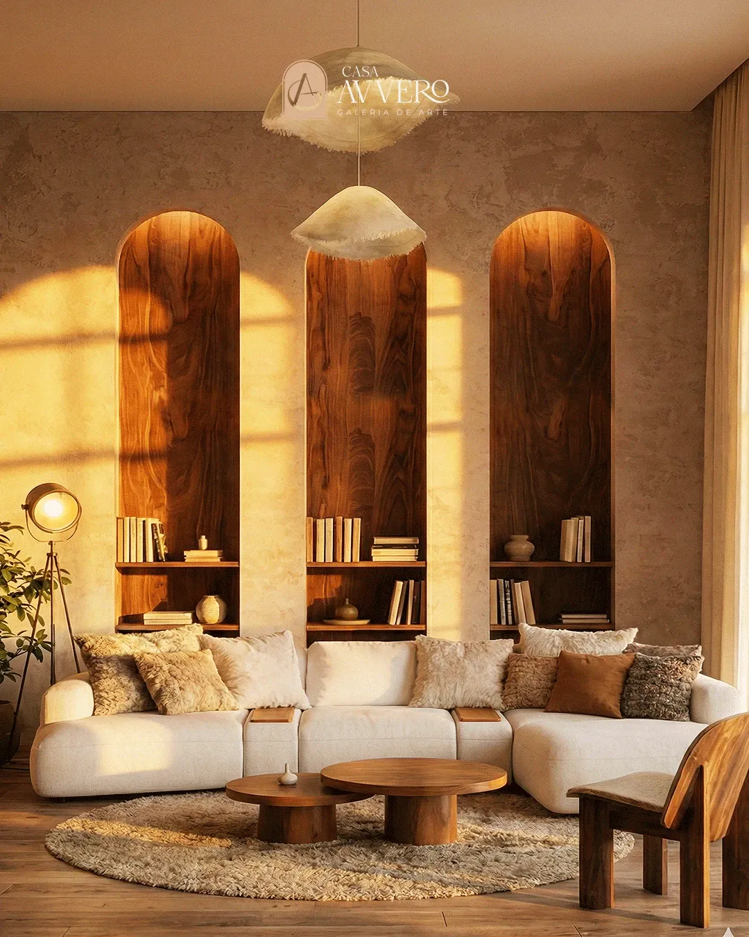
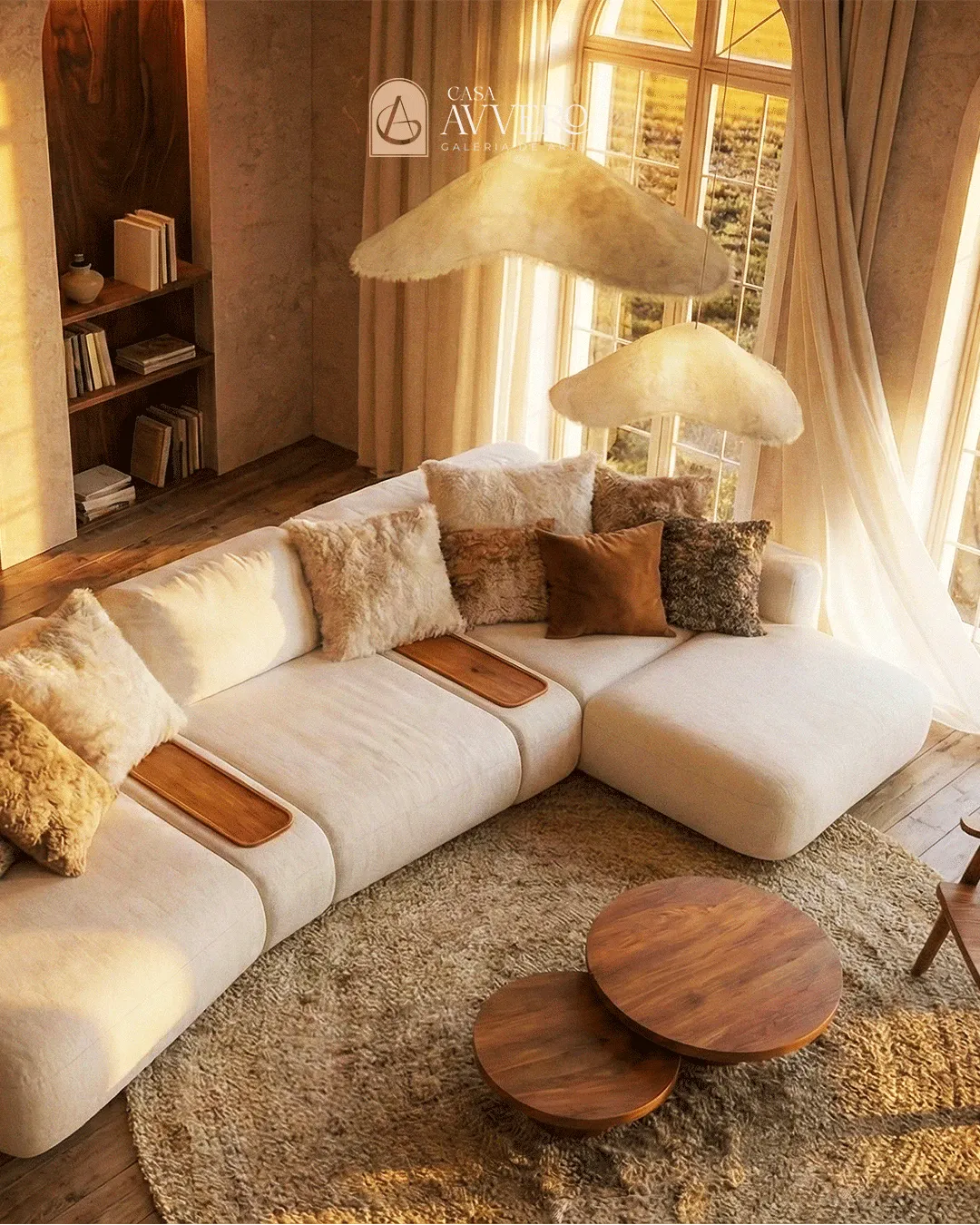
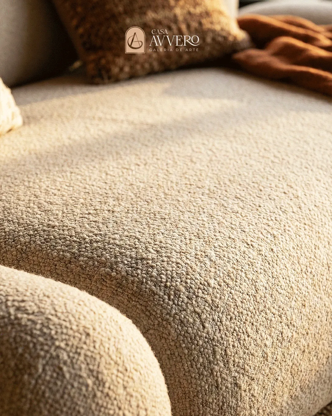
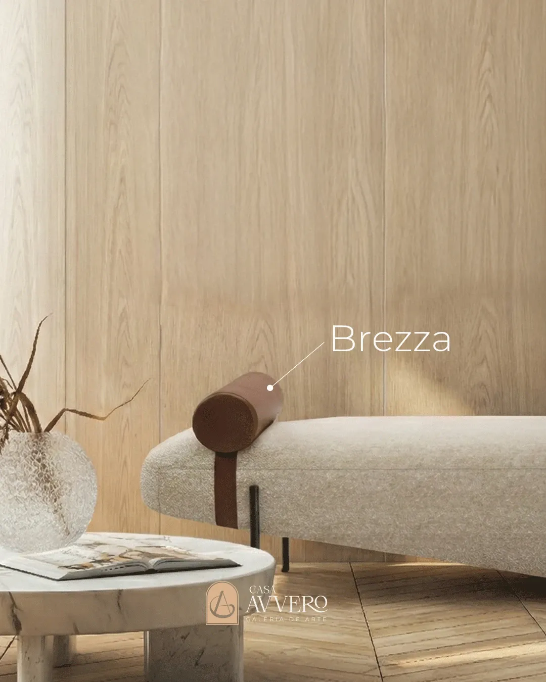
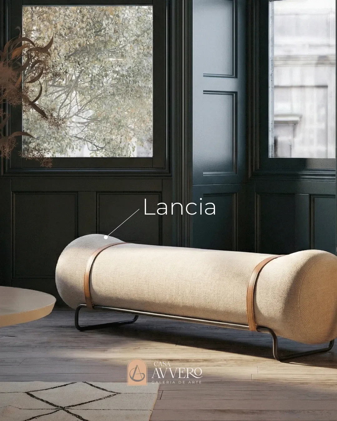
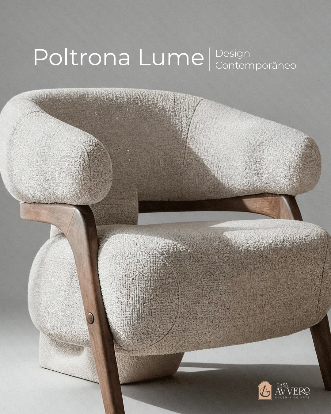
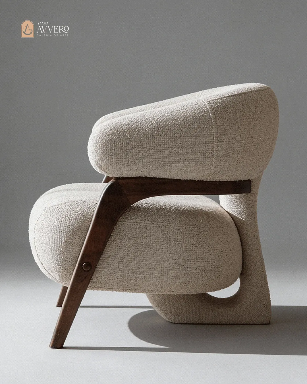
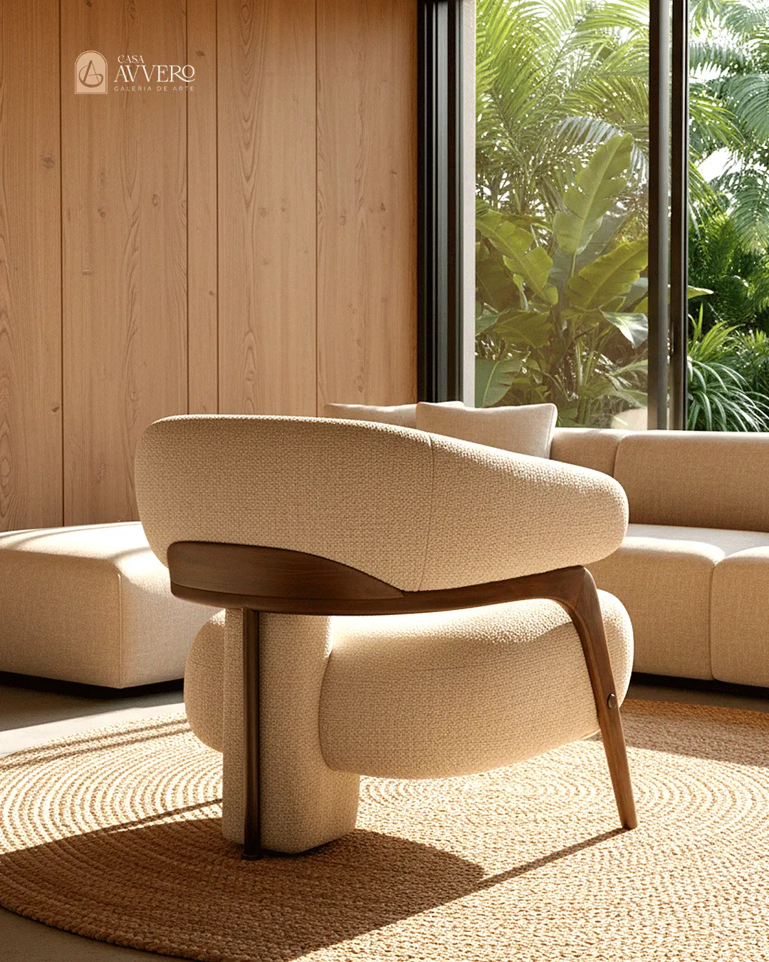
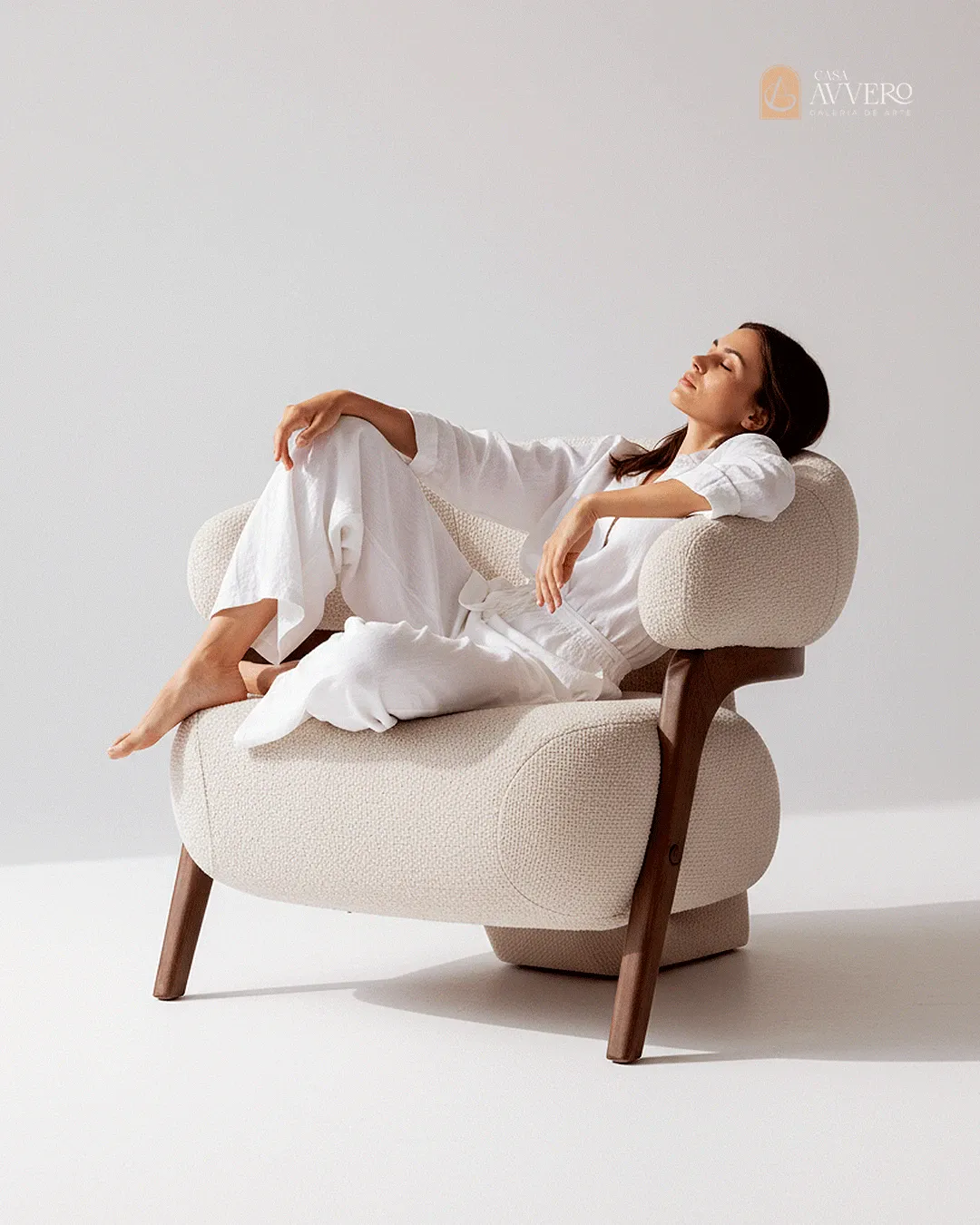
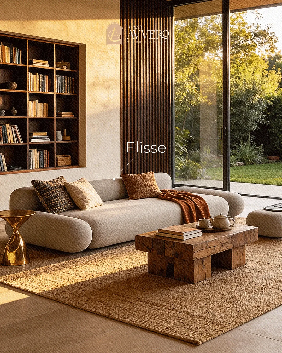
From print, the same language moves to the feed. The social media pieces carry the catalog's editorial calm into a format that usually rewards noise: each post gives a single piece the same framing, the same air, the same restraint. It is what keeps Casa Avvero recognisable from the exhibition catalog to the Instagram grid and every touchpoint in between — one refined, authorial voice instead of a loud one.
02Creative Process
From invite to catalog
I was invited to design the catalog for the gallery's exhibition, so I started where a curator would: with the pieces. I spent time understanding the collection, the materials and the story behind each design, and only then decided the sequence — how one piece hands off to the next — before touching a single page. From there I built the editorial system, grid, type, rhythm and the photographic treatment, and laid out the catalog so that reading it feels like walking a show: an entrance, a pace, and room to pause on the pieces that deserve it.
The social partnership
The relationship didn't end with the catalog. I stayed on as the brand's designer for social media, translating that same refinement into a steady flow of posts. Working continuously with Casa Avvero lets me keep the language consistent over time, so the exhibition and the feed clearly belong to the same house.
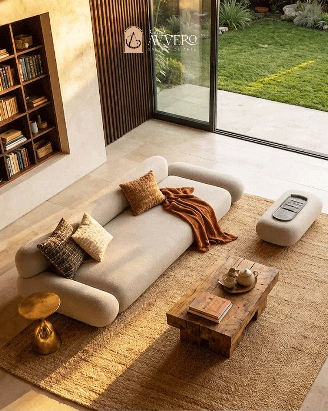
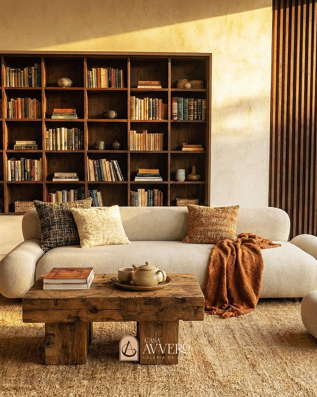
Outcome
The result is a catalog that reads like an exhibition and a social presence that carries the same weight, one editorial language that treats authorial furniture as what it is: collectible design. It gives Casa Avvero a printed piece worthy of its gallery and a feed that keeps that promise week after week.
Referencebehance.net/gallery/243159151